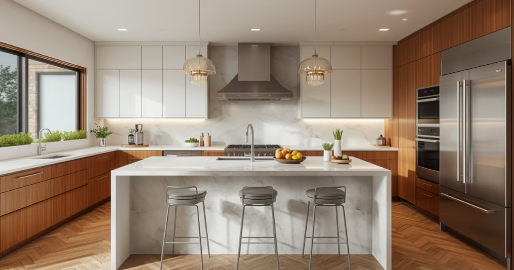
17 Modern Kitchen Color Ideas That Work in Real Homes
Color is the most personal decision in a kitchen remodel. It is also the most reversible. These 17 ideas cover the full range from safe and timeless to bold and committed.
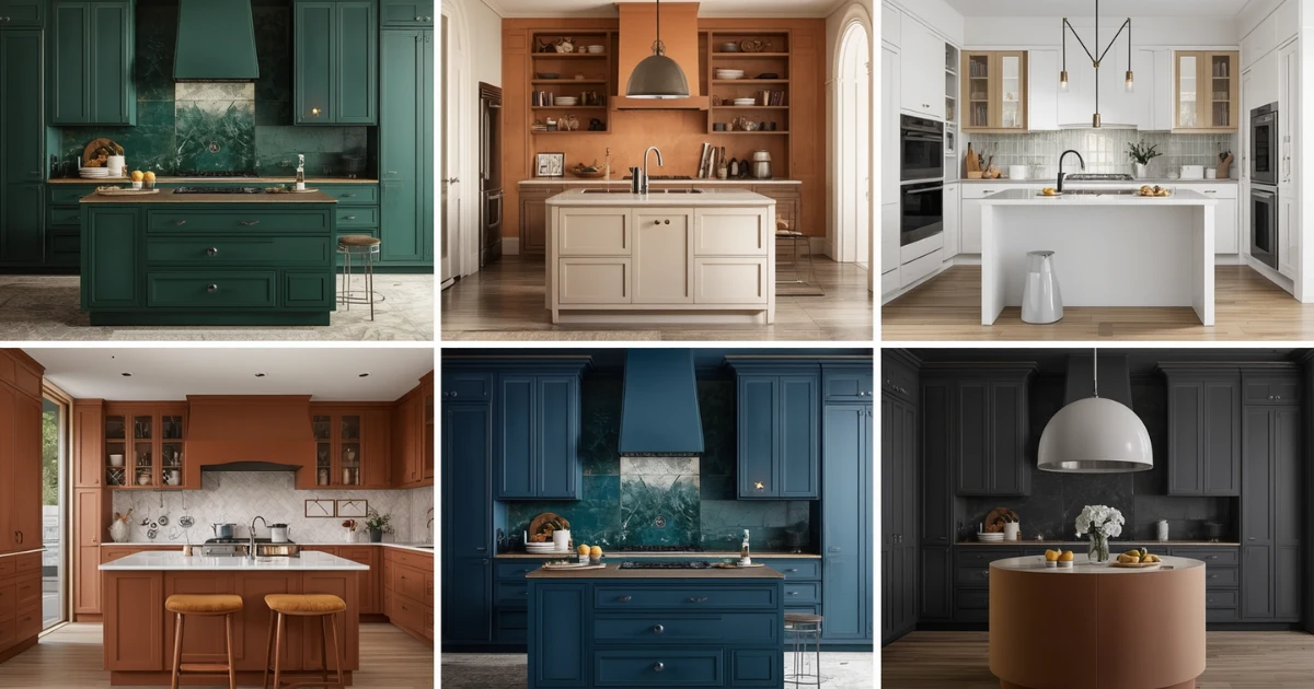
Color is the decision most people agonize over longest and get wrong most often. They choose something they love on a paint chip, live with it under their kitchen lighting for three months, and then quietly resent it.
The problem is almost never the color itself. It is the undertone, the finish, the way it reads against the specific flooring and countertop and hardware that the kitchen already has. Color does not exist in isolation. It exists in context.
These 17 ideas are organized by color family so you can find the territory that appeals to you and then understand what makes it work and what makes it fail. Each idea includes specific paint directions and honest advice about who it suits and who it does not.
Our interior design style quiz takes two minutes and gives you a clear color and style direction before you commit to anything.
Whites & Neutrals
Ideas 1–4Warm White: The Modern Default
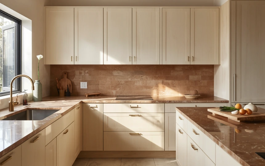
The era of the stark, blue-white kitchen is over. What has replaced it is warmer, creamier, and significantly more livable.
Warm white reads completely differently from cool white under the same light. Where cool white can feel clinical and flat, warm white glows. It catches morning light in a way that makes the kitchen feel genuinely inviting rather than efficiently designed.
The undertone is everything. Look for whites with yellow, pink, or greige undertones rather than blue or grey ones. Benjamin Moore White Dove, Farrow and Ball All White, and Sherwin-Williams Alabaster are benchmark choices in this direction. Each reads slightly differently depending on the other materials in the kitchen, which is why testing a sample on your actual walls matters.
Pair warm white cabinets with aged brass or champagne bronze hardware, creamy quartzite or warm-toned quartz countertops, and handmade or slightly textured backsplash tiles rather than high-gloss subway tile. The whole palette moves toward warmth together.
Greige: Warm Grey That Never Dates
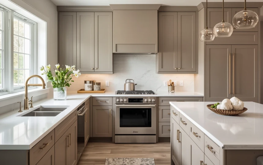
Greige sits in the space between grey and beige, leaning neither too warm nor too cool. It is the neutral that looks good in almost any kitchen and under almost any lighting condition.
The reason it works so well is that it is genuinely adaptable. Against white countertops it reads almost grey. Against warm wood floors it reads almost beige. It shifts with its context rather than fighting against it. That quality makes it one of the safest choices for anyone uncertain about committing to a stronger color.
Farrow and Ball Elephant’s Breath, Benjamin Moore Pale Oak, and Sherwin-Williams Accessible Beige are widely used benchmarks in this family. All three have been popular for long enough to demonstrate that they genuinely hold up well over time without looking dated.
Hardware choice shifts the reading significantly. Brushed nickel pushes greige toward cooler and more contemporary. Aged brass pushes it toward warmer and more transitional. Both work. Decide which direction you want before committing to the hardware finish.
Warm Grey: The Considered Neutral
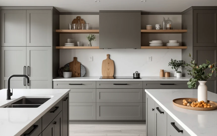
Warm grey is the sophisticated middle ground between greige and the cooler greys that dominated the 2010s. It has enough grey to read as contemporary and restrained, enough warmth to avoid feeling clinical.
The trap with grey kitchens is choosing a grey with too much blue or purple in the undertone. Under incandescent or warm LED lighting, these undertones become pronounced and the kitchen starts to look cold and slightly lavender. Always test grey paint samples specifically under the lighting conditions your kitchen will actually have.
Farrow and Ball Mole’s Breath, Benjamin Moore Coventry Gray, and Sherwin-Williams Dovetail all perform well in kitchen applications. All three have enough warmth in the undertone to read comfortably under a range of lighting conditions.
Warm grey works particularly well in kitchens with matte black or dark charcoal hardware. The grey-to-black contrast is sharp and contemporary without being aggressive. Add a white oak shelf or butcher block island section to prevent the combination from feeling too monochromatic.
Crisp White: Still Relevant When Done Right
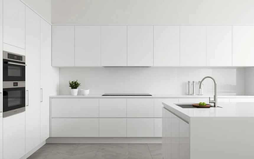
Pure white is not wrong. It is just demanding. A crisp white kitchen requires everything else to be equally precise. The materials need to be excellent, the hardware needs to be thoughtful, the styling needs to be edited. A white kitchen with average materials and too much clutter looks like a rental unit. A white kitchen with beautiful materials and strong restraint looks like architecture.
The key is the finish. Matte or satin white reads as modern and composed. Gloss white reads as dated and shows every mark. Specify a matte or eggshell finish on white kitchen cabinets without exception.
The version of white that is actually interesting right now leans slightly cool with minimal undertone, applied to handleless flat-front cabinetry in a floor-to-ceiling configuration. That combination is clean enough to read as deliberate design rather than default choice.
If your kitchen has excellent natural light and you are willing to maintain the discipline a white kitchen requires, it remains one of the most powerful color choices available. If the kitchen is dark or the household is chaotic, warm white or greige will serve you considerably better.
Greens
Ideas 5–8Deep Forest Green: The Standout Color of the Decade
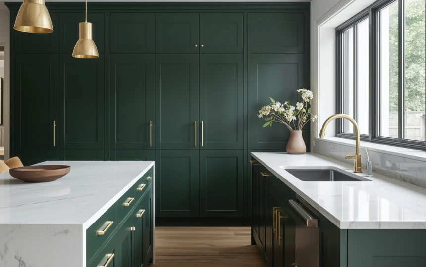
If there is one color that defines kitchen design in the mid-2020s, it is deep forest green. It has appeared in more kitchen renovations, more design publications, and more Instagram feeds than any other cabinet color of this period. And unlike many trends, it has a clear reason for its longevity.
Green is connected to nature. It is grounded and calm. It makes the kitchen feel like it belongs to a person who pays attention to how their home feels rather than just how it looks. And it is genuinely versatile in a way that few bold colors are. It works with brass hardware, with black hardware, with white countertops, with stone countertops, with wood floors, and with tile floors.
Farrow and Ball Studio Green, Paint and Paper Library Puck Green, and Sherwin-Williams Hunt Club are benchmark colors in this territory. All three are deep enough to feel significant without being so dark that they close a room down.
The hardware pairing that matters: unlacquered brass. The warm metal brings out the richness of the green and the combination feels simultaneously timeless and completely of the moment. If unlacquered brass maintenance is a concern, aged brass or brushed gold are equally compatible alternatives.
Sage Green: Soft and Livable
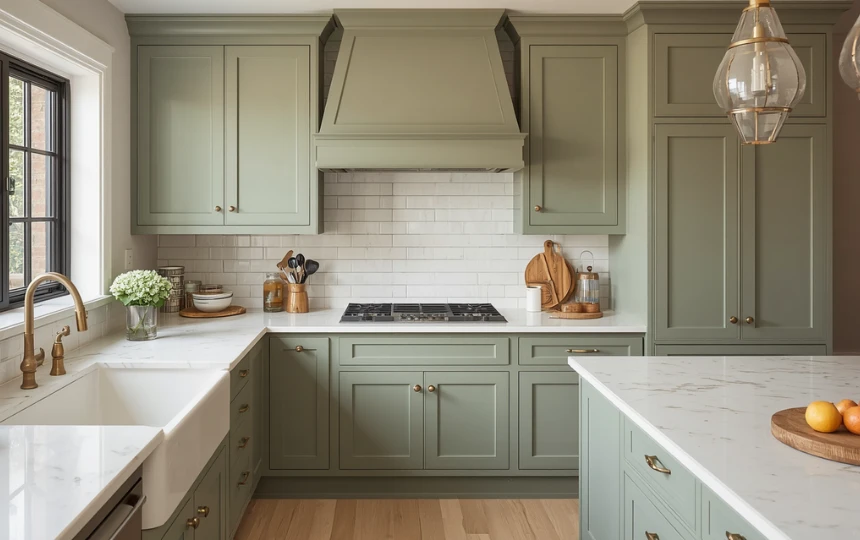
Sage green is forest green’s softer, more approachable sibling. It carries the same connection to nature and the same warmth, but at a lower intensity that suits smaller kitchens, north-facing rooms, and homeowners who want color without full commitment.
The grey undertone in most sage greens keeps them from reading as too olive or too yellow. They sit in a pleasantly ambiguous territory between green and grey that photographs beautifully and holds up well over time. It is genuinely difficult to look at a well-executed sage green kitchen and pinpoint when it was done.
Farrow and Ball Mizzle, Benjamin Moore Saybrook Sage, and Sherwin-Williams Pewter Green are benchmark options. All three have the muted quality that distinguishes considered sage green from the brighter, more juvenile greens that look good in a sample but exhausting as a full kitchen.
Aged brass hardware is the natural partner. Cream or warm white countertops work best. Against very cold stone or stark white, sage green can push slightly towards grey. Keep the palette warm throughout.
Olive Green: Earthy and Sophisticated
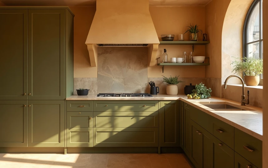
Olive green sits at the intersection of green and yellow and occasionally brown. It is earthier than sage and less saturated than forest green, which gives it a distinctly Mediterranean and artisanal quality that neither of its neighbors can match.
It suits warm kitchens with natural materials. Terracotta floors, warm stone countertops, handmade tile backsplashes, and natural wood elements all work beautifully alongside olive green cabinets. It is a color that belongs in a kitchen that smells of food and has fresh herbs on the windowsill.
The risk with olive is the yellow undertone. Under cool fluorescent lighting, olive green can look slightly jaundiced. Under warm incandescent or LED lighting at 2700K, it looks rich and complex. This is a color that requires the right lighting to perform at its best. Plan the lighting before committing to the color.
Antique gold or unlacquered brass hardware is the ideal pairing. The yellow tones in the hardware complement the yellow-green of the olive without fighting against it.
Racing Green: Bold and British
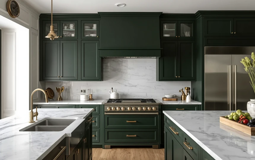
Racing green or bottle green sits at the darkest end of the green spectrum, close enough to black that in low light it reads almost as a very deep, complex dark. In good natural light the richness of the green becomes visible and the effect is extraordinary.
This is a commitment color. It is not for indecisive renovators or anyone planning to sell in the next two years. It is for people who know what they want and want a kitchen that looks like it was designed with real conviction.
It works in rooms with good natural light. In a dark kitchen, a color this deep and saturated can feel oppressive. In a well-lit kitchen with large windows, it creates a depth and drama that more cautious colors simply cannot.
Farrow and Ball Calke Green and Brassica, Little Greene Invisible Green, and Paint and Paper Library Racing Green are benchmark options. All have the necessary depth without crossing into black.
Blues & Navy
Ideas 9–11Classic Navy: The Timeless Bold Choice
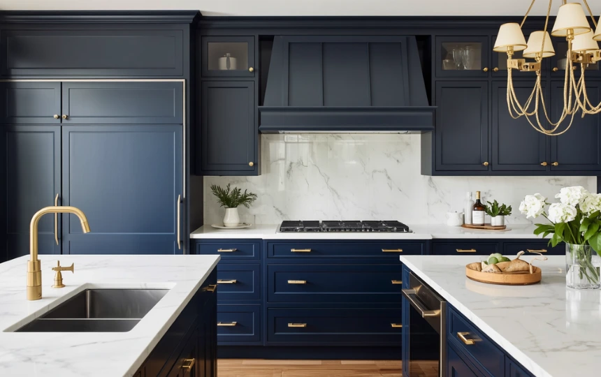
Navy has been a reliable kitchen color for long enough to qualify as genuinely timeless rather than fashionable. It has appeared in kitchen design consistently across multiple decades and style periods without looking dated. That kind of staying power is rare.
The reason is contrast. Navy against white countertops is one of the most satisfying color combinations in interior design. The dark-light relationship has an inherent tension that reads as considered and deliberate. It does not require interesting materials or clever details to work. The color combination alone carries the room.
Benjamin Moore Hale Navy, Sherwin-Williams Naval, and Farrow and Ball Hague Blue are the most used benchmarks. All three have the depth and cool-blue quality that makes navy rather than just dark blue. The distinction matters: a navy that veers too purple or too green loses the crispness that makes it work against white.
Navy works best in rooms with good natural light. In a north-facing or small kitchen, push toward a slightly lighter value in the same blue family rather than full navy. The color needs light to show its quality.
Dusty Blue: Calm and Characterful
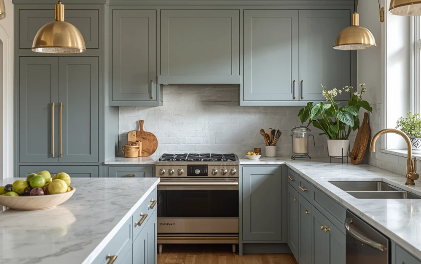
Dusty blue is the muted, grey-inflected version of blue that feels calm and considered rather than bright or nautical. It is one of the more underappreciated colors in kitchen design.
Where navy is bold and high-contrast, dusty blue is quiet and layered. It suits Scandi-adjacent kitchens, farmhouse-modern kitchens, and any kitchen where the design goal is warmth and character rather than drama and precision.
Farrow and Ball Parma Gray, Benjamin Moore Grayish, and Sherwin-Williams Refuge are examples in this family. All have enough grey in the mix to prevent the blue from feeling too vivid or too coastal. They read as complex rather than simply blue.
Aged brass hardware is the ideal pairing. The warm metal tones pull the slightly cool blue toward warmth and the combination reads as genuinely considered. Avoid chrome or polished nickel hardware with dusty blue, which pushes it toward cold and slightly clinical.
Inky Blue-Black: Drama Without Full Commitment to Black
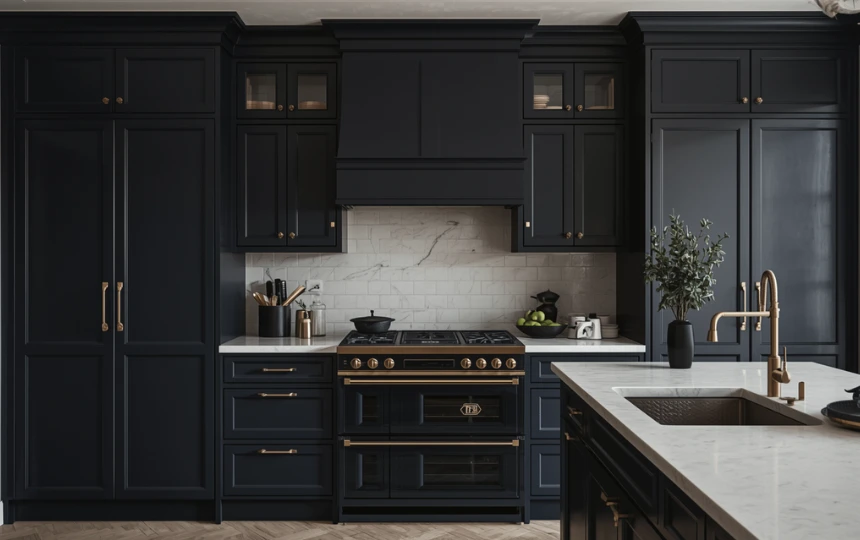
Inky blue-black occupies the interesting territory between navy and black. In low light it reads almost as black. In bright natural light the blue becomes visible and gives the color a richness and depth that pure black cannot match.
It is the right choice for homeowners who are drawn to the drama of a dark kitchen but are not quite ready for the full commitment of all-black. The blue undertone softens it slightly and makes it more livable in rooms that are not perfectly lit.
Farrow and Ball Railings, Little Greene Lapis, and Benjamin Moore Black Horizon are all examples in this territory. None of them are blue in a conventional sense. They are more accurately described as colors that happen to have blue in them when examined closely.
Brass hardware with inky blue-black produces one of the most sophisticated combinations in modern kitchen design. The warm gold against the dark, complex blue-black creates a jewel-like quality that photographs extraordinarily well and looks even better in person.
Earthy & Warm Tones
Ideas 12–14Terracotta: Warm Earth That Endures
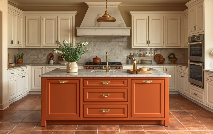
Terracotta is not a trend. It is a color that has existed in Mediterranean and Middle Eastern architecture for thousands of years because it is made from the same material as the earth it sits on. That connection to natural materials is why it has such enduring appeal.
In a modern kitchen, terracotta works best as an accent rather than the primary color. A terracotta island against white perimeter cabinets. A terracotta backsplash tile in an otherwise neutral kitchen. A terracotta floor in a kitchen with cream cabinets. The color is strong enough that a little goes a long way.
The shade matters significantly. The most wearable version of terracotta in a kitchen leans slightly towards burnt orange or dusty clay rather than bright orange or rusty brown. Farrow and Ball Charlottes Locks, Little Greene Tuscan Red, and Benjamin Moore Navajo Red are all worth sampling in this territory.
Matte brass or antique gold hardware is the natural partner. Linen textiles, handmade ceramics, fresh herbs, and natural wood surfaces all reinforce the warm, artisanal character that terracotta brings.
Warm Ochre and Mustard: Sunshine in a Kitchen
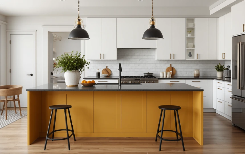
Warm ochre and mustard yellow are not for cautious renovators. They require confidence and a specific kind of kitchen aesthetic to work. When they work, the result is genuinely joyful.
The key is the quality of the yellow. Mustard yellow (golden, warm, slightly brown-inflected) works in kitchens. Bright primary yellow does not. The difference is in the warmth and depth. A muted, earthy yellow reads as considered and sophisticated. A bright, saturated yellow reads as a child’s bedroom.
This color works best as an accent on the island or a single run of lower cabinets against white uppers. It is a bold island color that creates instant personality in an otherwise neutral kitchen without requiring you to commit the whole room to a difficult color.
Matte black hardware grounds ochre and prevents it from feeling too cheerful. The dark metal contrast gives the kitchen enough seriousness to balance the warmth of the yellow.
Dusty Pink: Grown-Up Blush
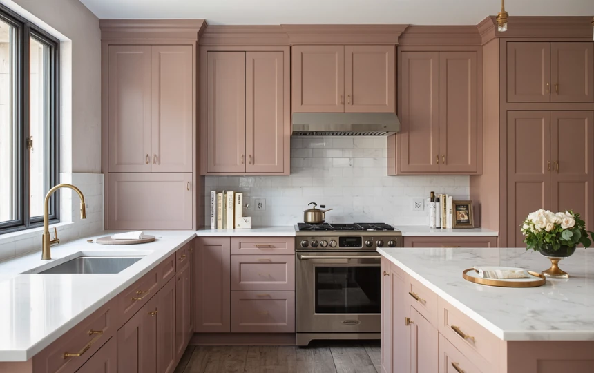
Dusty pink in a kitchen is not as unusual as it sounds. The key word is dusty. A bright or sugary pink belongs in a child’s room. A muted, grey-inflected blush pink belongs in a kitchen where the design aesthetic leans toward warm, organic, and slightly unexpected.
Farrow and Ball Middleton Pink and Peignoir, Benjamin Moore Pink Damask, and Little Greene Pink Slip are examples in the right territory. All have enough grey in the mix to prevent the pink from reading as frivolous. They are closer to clay or warm stone than to candy.
This color suits kitchens with warm stone or quartz countertops, aged brass hardware, and natural wood accents. Against cold white stone or chrome hardware, dusty pink looks uncertain. Against warm materials, it looks quietly beautiful.
Consider it for the island only before committing to the full kitchen. A dusty pink island against greige or warm white perimeter cabinets is a particularly elegant combination that most people would not identify immediately as pink in passing.
Dark & Dramatic
Ideas 15–17Charcoal: The Versatile Dark
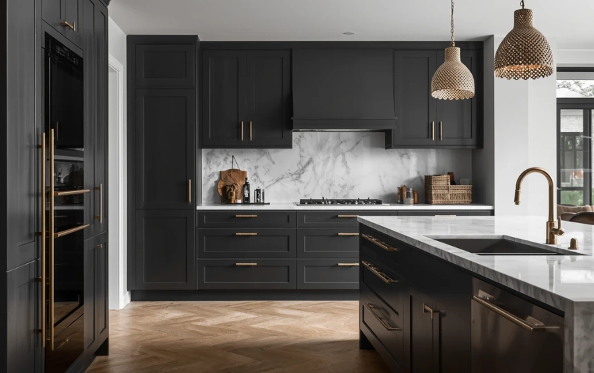
Charcoal is the dark kitchen color with the widest appeal. It is more approachable than black, more interesting than grey, and more versatile than navy. It works with almost any countertop material, any hardware finish, and any flooring.
The distinction between charcoal and dark grey matters. True charcoal has enough warmth in the undertone to prevent it from feeling cold. The grey-with-brown or grey-with-green versions that exist in this territory are significantly more livable than the grey-with-blue versions, which can feel cold under artificial lighting.
Farrow and Ball Off-Black, Benjamin Moore Wrought Iron, and Sherwin-Williams Peppercorn are benchmark options. All three are dark enough to be decisive without being so dark that they close a kitchen down in rooms with moderate natural light.
Charcoal is one of the few dark colors that works in two-tone applications. Charcoal lowers with warm white uppers is a combination with enormous versatility and visual clarity. It grounds the kitchen without committing the whole room to darkness.
Two-Tone Color Combinations
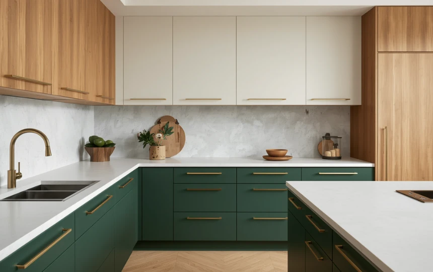
Two-tone cabinetry is not a compromise. It is a design strategy with genuine logic behind it. Darker lowers and lighter uppers ground the kitchen visually, mimic the way furniture works, and allow you to introduce color without overwhelming the room.
The combinations that work best have real contrast and clear separation. The countertop serves as the natural dividing line between the two colors. When the transition happens at the countertop level, the two colors read as intentional. When it happens at an arbitrary point above or below the countertop, it looks like a planning mistake.
The pairings worth considering: forest green and warm white. Navy and cream. Charcoal and off-white. Dusty blue and warm grey. Sage green and linen. In each case the darker color carries the visual weight at the bottom and the lighter color keeps the upper portion of the kitchen open and bright.
Keep hardware consistent across both cabinet colors. Using the same finish on dark lowers and light uppers is what makes the combination read as designed rather than accidental. Changing the hardware between the two tones breaks the visual coherence.
All-Black: Total Commitment
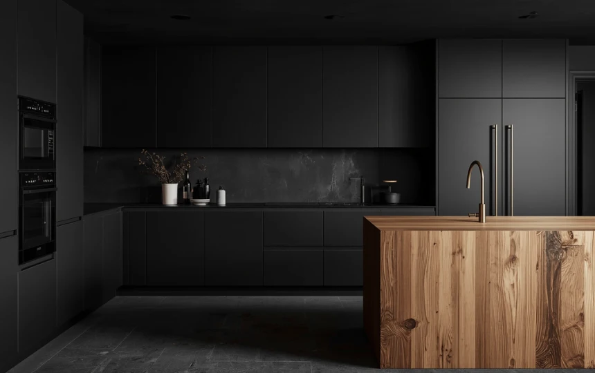
An all-black kitchen is the most committed design decision on this list. You cannot half-do it. A half-hearted attempt at a black kitchen produces a tired, dreary result. A fully committed one is extraordinary.
The commitment extends beyond just the cabinet color. Matte black cabinets alongside honed black stone or concrete countertops, matte black fixtures, and dark integrated appliances. Every surface contributes to the monochrome narrative. Shiny or polished surfaces break it. Inconsistent material choices break it. Half-measures break it.
The essential counterbalance is warmth. Natural wood is the most effective antidote to the oppressiveness that all-black can develop without it. A butcher block island section, floating oak shelves, or a warm wood dining table adjacent to the kitchen introduces the human warmth that makes the darkness feel deliberate rather than depressing.
Specify matte black rather than gloss black without exception. Gloss black shows water spots, fingerprints, and scratches immediately and constantly. Matte black is forgiving, sophisticated, and ages beautifully in a way that gloss black never does.
The One Thing That Changes Every Color Decision
Natural light. A color that looks rich and considered in a well-lit south-facing kitchen will look flat or cold in a north-facing one. Before choosing any cabinet color, spend a day in your kitchen noting how the light changes from morning to evening and whether it is warm or cool. Dark colors need good light to show their depth. Warm colors need warm light to prevent them from looking muddy. Cool greys and blues need warmth from other materials to prevent them from reading as cold. The best color for your kitchen is the best color for your specific kitchen’s light, not a color you saw on Instagram.
Pick One Direction and Commit to It Properly
The kitchens that look best are never the ones that tried to accommodate every preference or hedge against every risk. They are the ones that made a clear color decision and then made everything else in the kitchen support that decision.
Warm white with aged brass and handmade tile. Deep green with unlacquered brass and white quartz. Navy with crisp white countertops and black hardware. Two-tone charcoal and cream. All-black with butcher block and warm wood. Each one is a complete, coherent direction. Choose one and commit.
Order paint samples before you do anything else. Put them on the actual walls. Look at them under morning light, afternoon light, and evening light. The right color will look right under all three.
Frequently Asked Questions About Kitchen Colors
Deep forest green remains the most widely chosen bold cabinet color of the mid-2020s. Among neutrals, warm whites and off-whites have overtaken cool whites as the most popular choice. Two-tone cabinetry with darker lowers and lighter uppers is the most widely adopted design approach across the widest range of styles. Navy blue remains a consistent classic choice, and charcoal continues to grow in popularity as an alternative to full black.
Warm white, greige, and navy have proven their longevity across multiple design periods and style shifts. All three have been relevant in kitchen design for decades without looking dated when executed well. Natural wood veneer and unpainted wood tones are perhaps the most genuinely timeless of all kitchen color directions, since they reference natural materials rather than a moment in design history. Among bold colors, deep greens have demonstrated enough staying power over the past five years to suggest they will remain relevant well into the next decade.
Warm white and greige cabinet colors consistently perform best in resale situations because they appeal to the widest range of buyers. They are readable as a blank canvas that buyers can imagine their own lives in. Bold colors like deep green, navy, and black can attract buyers who love them and deter buyers who do not. If selling within five years is a consideration, warm white, greige, or a very soft sage green are the safest choices. If this is your long-term home, choose the color that makes you want to spend time in it.
Unlacquered brass is the most complementary hardware finish for green cabinets across all shades of green. The warm, yellow-toned metal brings out the richness of the green and the combination feels simultaneously current and timeless. Aged brass and brushed gold are close alternatives that require less maintenance than unlacquered brass. Matte black works well against lighter greens like sage, creating a more contemporary and somewhat edgier result. Avoid chrome and polished nickel with green cabinets, which push the combination toward cool and clinical.
They do not need to be. Two-tone cabinetry with different colors on upper and lower cabinets is a well-established design approach with genuine visual logic: the darker color at the bottom grounds the room, the lighter color at the top keeps it open and bright. The key to making it work is maintaining the same door profile on both and keeping the hardware finish consistent. The two-tone approach is also more forgiving of limited natural light than painting the entire kitchen in a bold dark color.
Start by assessing your kitchen’s natural light. South-facing kitchens with warm light can carry cooler or darker colors. North-facing kitchens need warmer undertones to compensate for the blue-grey quality of the light. Then look at the fixed elements you cannot change: flooring color and tone, countertop color, and window size. Choose a paint color that works with those elements rather than against them. Order at least three samples in the direction you are considering, paint large swatches on the actual walls, and observe them at different times of day for at least 48 hours before making a final decision.