11 Modern Kitchen Wall Decor Ideas That Feel Personal, Not Generic
Most kitchen wall decor ends up looking like it came from a catalog. These 11 ideas show how to make your kitchen walls feel like they belong specifically to you.
Kitchen walls are easy to get wrong in both directions. Too bare and the room feels unfinished and cold. Too decorated and it starts to look busy and fussy.
The kitchens that get this right share one quality: the wall decor feels like it belongs to the people who live there. Not like it was bought as a matching set. Not like it was recommended by an algorithm. Like it accumulated naturally over time.
These 11 ideas cover the full range of what works in modern kitchens. From low-cost and low-commitment through to architectural changes that will still look right in twenty years.
Display & Art
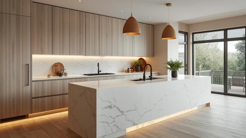
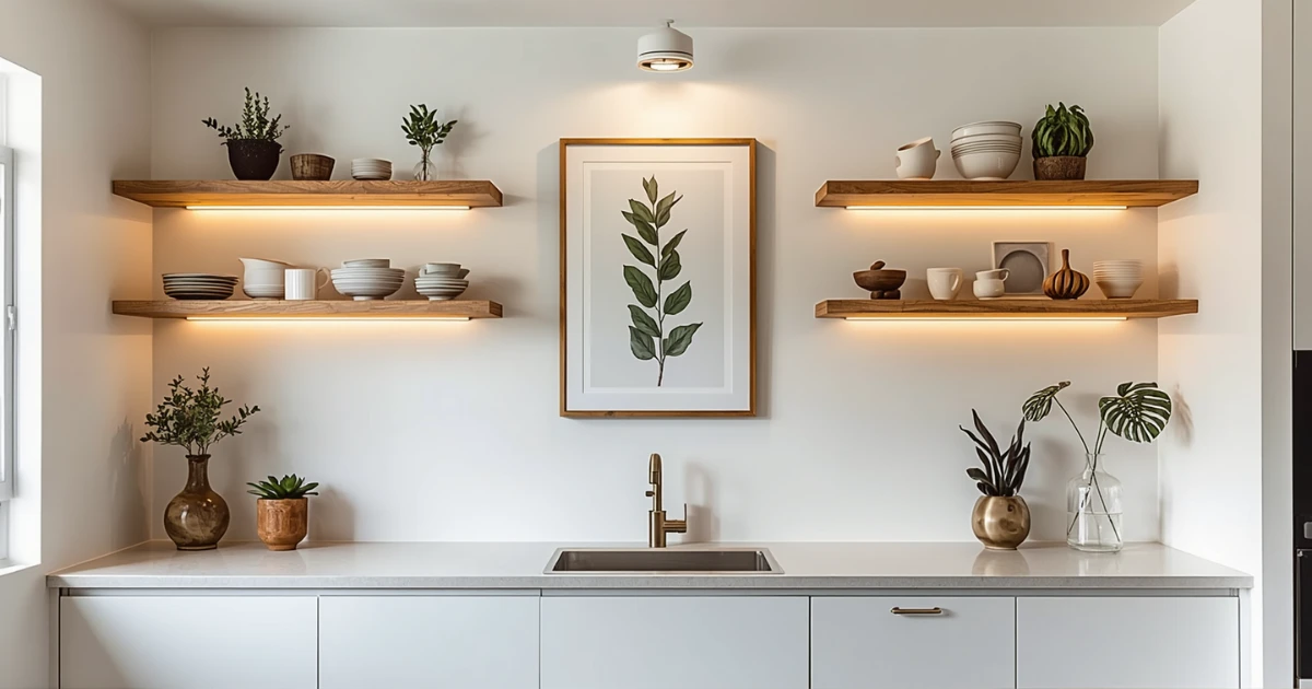
Ideas 1–6Styled Open Shelves
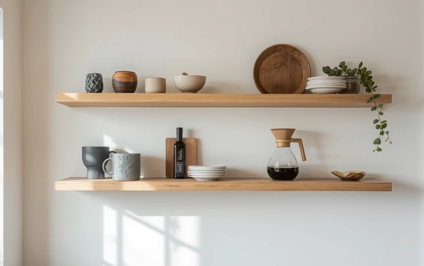
Open shelves are the most versatile kitchen wall treatment available. Done well, they add warmth, display your personality, and give the kitchen a lived-in quality that no amount of purchased decor can replicate.
The difference between open shelves that look good and ones that look cluttered comes down to editing. Each shelf should have breathing room. Aim for five to seven objects maximum per shelf, with clear space between each grouping. Mix heights: a tall bottle next to a low bowl next to a small plant.
The objects matter as much as the arrangement. Use things you actually own and actually use. A nice olive oil bottle. A ceramic mug you love. A small cookbook standing upright. These things photograph beautifully precisely because they are honest.
Shelf thickness matters too. A 2.5-inch solid wood shelf reads as furniture-grade and intentional. A thin bracket shelf reads as temporary. If you are committing to open shelves as a design feature, use the thicker version.
One Large Piece of Art
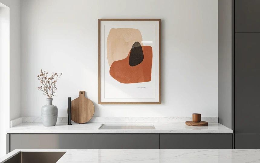
One large piece of art does more for a kitchen wall than ten small ones. The confidence of that single, substantial work tells you that the person who hung it knows what they are doing.
Kitchens are not usually thought of as gallery spaces. That is exactly why art looks so good in them. It is unexpected. It signals that the kitchen is a room to spend time in, not just a room to cook in.
The subject matter does not need to be food-related. In fact, obvious food and kitchen prints often look generic. Abstract work, botanical studies, landscape prints, and simple line drawings all work well. Choose something you would hang in a living room. The fact that it is in the kitchen will do the rest of the work.
Size matters. The piece should feel substantial relative to the wall. A small print on a large blank wall looks tentative. A large print hung with confidence looks intentional. If the wall is between two cabinet runs, the art should fill roughly two thirds of that width minimum.
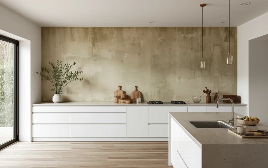
Ceramic and Pottery Display
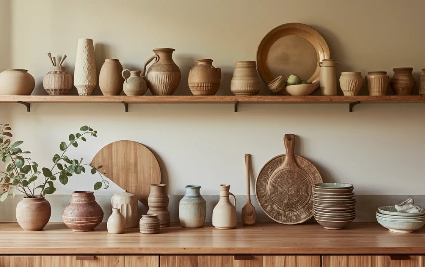
A collection of handmade ceramics is one of the most satisfying forms of kitchen wall decor because it is genuinely functional, genuinely personal, and impossible to replicate exactly.
Ceramics have a quality that mass-produced objects cannot match. The slight irregularity of a hand-thrown vase. The way glaze pools differently in each piece. The sense that someone made this specific object with their hands. That quality brings warmth into a kitchen in a way that prints or commercial decor rarely do.
You do not need a large or expensive collection. Three or four pieces grouped together on a shelf or ledge create enough visual interest. Mix heights and forms: a tall narrow vase next to a wide low bowl next to a small jug. Use pieces in tones that relate to the kitchen’s color palette without matching it exactly.
Local potters, craft markets, and small ceramic studios are worth exploring. The pieces you find there will look better and feel more personal than anything from a mainstream homeware shop. They will also appreciate in meaning over time in a way that a generic vase simply does not.
Architectural Panelling
Applied wall panelling is one of those architectural details that makes a kitchen feel like it was designed rather than assembled. It costs relatively little and has a disproportionate effect on how the space reads.
A simple grid of flat panel mouldings applied to a plain wall and painted in a single color adds genuine depth and texture. Paint it the same color as the surrounding cabinetry and the whole kitchen gains a unified, furniture-like quality. Use a contrasting color and the panelled wall becomes a feature.
This works particularly well on the wall at the end of a kitchen, or on the wall behind a dining table adjacent to the kitchen. It frames the space without closing it in. And unlike wallpaper or paint effects, it casts real shadow lines as the light changes throughout the day, which gives the wall a subtle, living quality.
A competent DIYer can apply simple panel moulding in a weekend using MDF strips and panel adhesive. Professional installation is faster and cleaner. Either way, the material cost is modest. Most of the budget goes into the paint finish, which needs to be flawless for this to look right.
A Wall Herb Garden
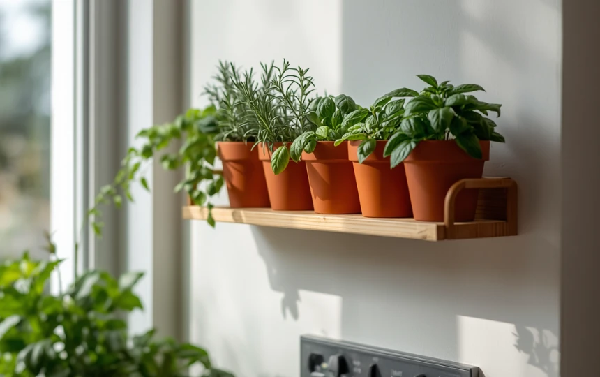
A wall-mounted herb garden is the most genuinely functional form of kitchen wall decor. It looks good. It smells good. And it is useful every time you cook.
The simplest version is a wall-mounted wooden rail with small terracotta pots suspended from it. Rosemary, thyme, basil, mint, and chives are all compact enough to work well in small pots. Position it near a window where the plants will get adequate light without sitting directly on the windowsill and blocking the view.
A more designed approach is a built-in herb planter with an integrated drip tray, recessed slightly into the wall or mounted at a consistent height as a purposeful element rather than an afterthought. Some kitchen designers now include a dedicated herb niche in the kitchen plan alongside the open shelves and the backsplash zone.
The visual effect of living green plants at eye level in a kitchen is significant. The color, the texture, and the slight movement when someone walks past all contribute to making the kitchen feel alive in a way that static decor cannot match.
A Kitchen Gallery Wall
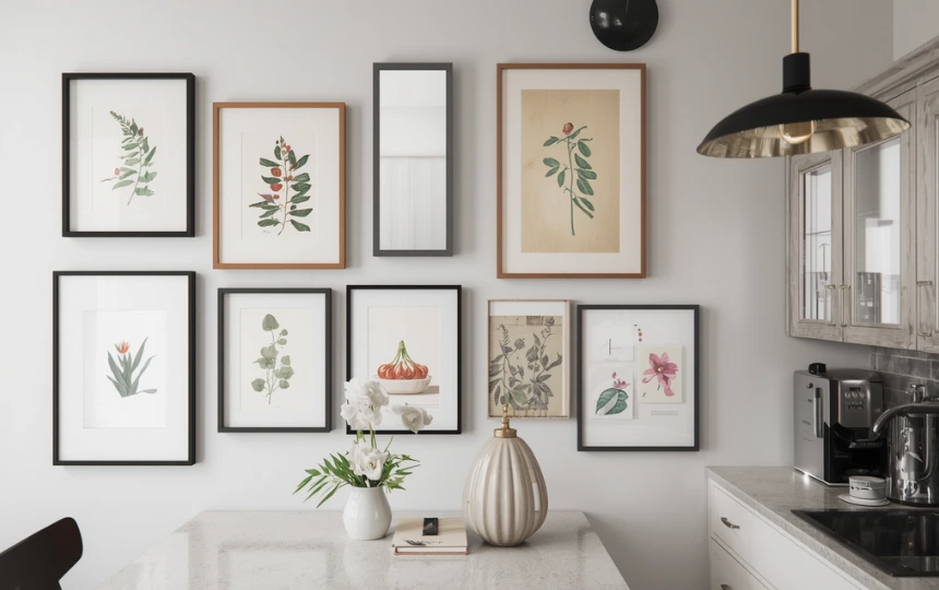
A gallery wall in a kitchen is riskier than a gallery wall in a living room. The kitchen has strong competing visual elements already. Cabinets, countertops, backsplash, lighting. Adding a collection of framed work to that environment requires more restraint than the same thing in a simpler room.
The version that works is tightly curated, with consistent framing and enough white space between pieces that each one can breathe. All black frames, or all natural wood. No more than six or seven pieces. A mix of sizes but not too wild a range. At least one piece that is substantially larger than the others to anchor the composition.
Place it on the wall that has the least competition. A blank end wall, or the wall above a small dining table adjacent to the kitchen. Avoid the wall behind the range or directly above the sink where steam and cooking vapors will damage the work over time.
Lay the arrangement out on the floor before committing to holes in the wall. Live with the layout on the floor for a day. Move pieces around. Only commit to hanging when you are genuinely happy with the composition, not when you think it looks good enough.
One Statement Per Wall
The rule that prevents kitchens from looking cluttered: one statement per wall. Open shelves on the left wall. One large piece of art on the right wall. Nothing competing on the same surface. A kitchen that already has a bold backsplash does not need art above it. A kitchen with a feature panelled wall does not need shelves on that same wall. Each wall should have one thing it is doing well. Not three things doing badly.
Texture, Function & Architecture
Ideas 7–11Pegboard or Grid Wall
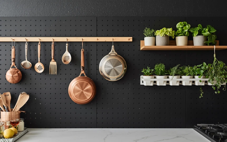
A pegboard wall is one of the most honest forms of kitchen wall decor. It does not pretend to be purely decorative. It holds things. And when it holds beautiful things, it looks genuinely good.
Copper pots and pans hung from a matte black pegboard. Wooden spoons and linen towels on a white-painted panel. Cast iron skillets hanging from industrial hooks on a raw steel grid. The objects you cook with every day can be the wall decor if they are good enough objects and arranged with some intention.
The grid panel system (square metal grids with custom accessories) is a more refined alternative to standard pegboard. Brands like String and IKEA’s Kungsfors both make versions that look more considered than standard workshop pegboard. Paint the board or grid panel to match the kitchen color palette and it becomes part of the design rather than an equipment storage solution bolted to the wall.
This works best in smaller kitchens where counter and cabinet space is limited, or in professional-aesthetic kitchens where the display of tools is part of the design language. It is less at home in very polished, minimal kitchens where the visual principle is to hide everything.
A Mirror to Expand the Space
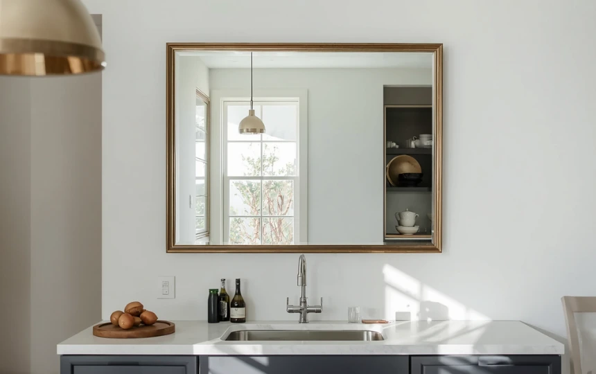
A mirror in a kitchen is an underused idea. Most people reserve mirrors for bathrooms and hallways. That is a shame, because a well-chosen mirror does two things in a kitchen that no other wall treatment can do simultaneously: it makes the room feel larger and it bounces light around.
In a small or north-facing kitchen where natural light is limited, a large mirror on a blank wall effectively doubles the visual depth of the room. The reflection of the kitchen back at itself creates a sense of space that no amount of white paint can achieve.
Antique or vintage mirrors with aged glass and simple frames work better in kitchens than new, perfectly clear mirrors. The slight mottling and warmth of aged glass reflects the kitchen in a flattering, atmospheric way rather than the slightly harsh quality of new mirror glass. An arched or oval mirror with a slim brass or dark metal frame suits contemporary kitchens particularly well.
Position it on a wall that reflects something worth reflecting. The view through a window. The pendant lights over the island. A well-styled shelf on the opposite wall. A mirror that reflects a blank expanse of cabinet doors is less effective than one that shows you something beautiful.
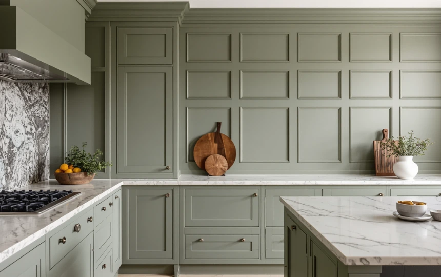
Vintage or Antique Objects
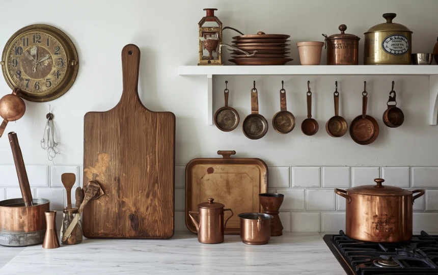
Old things in a new kitchen create a tension that is genuinely interesting. The worn edge of an antique cutting board against a fresh quartz countertop. A collection of vintage copper measures hanging from small hooks beside a modern range. These combinations tell you that someone lives here who thinks about more than just what is current.
Antique markets, estate sales, and online vintage shops are worth exploring for kitchen-adjacent objects that have genuine visual quality. Old wooden cutting boards with handles. Vintage enamel tins with original typography. Worn copper pots. Handmade ceramic crocks. Objects that were made to be used and have the marks of that use on them.
The restraint principle applies here too. One or two genuinely interesting vintage objects have more impact than a shelf crowded with antique finds. A single large antique cutting board propped against the backsplash is more powerful than five smaller ones arranged in a row.
These objects also tend to be more affordable than new designer homeware of comparable visual quality. A genuinely beautiful antique ceramic crock from a market might cost a fraction of what a new designer ceramic costs. And it will look better.
Limewash or Textured Paint as a Feature Wall
Sometimes the wall itself is the decor. A limewash paint finish creates a depth and layered variation that standard emulsion simply cannot match. The color shifts subtly from morning to evening as the light changes. It has a quality that makes people stop and look, even if they cannot immediately say why.
The technique involves applying multiple thin coats of lime-based paint in slightly varied directions, leaving each coat partially transparent so the layers beneath show through. The result is organic and atmospheric. No two walls look exactly alike.
Used on one feature wall in a kitchen, a limewash finish makes the decorating decision simple. That wall does not need art, shelves, or any other treatment. It is enough on its own. The other walls can be plain emulsion in a complementary color.
Brands like Portola Paints and Pure and Original produce high-quality limewash paints in excellent color ranges. Application requires some practice. Watch tutorial videos before attempting it, or hire a painter who has done it before. An uneven application looks amateurish rather than artistic.
Hanging Dried Botanicals
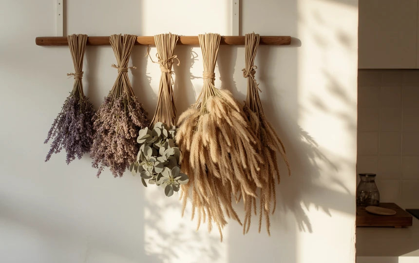
Dried botanicals are the lowest-effort, highest-impact wall treatment on this list. They cost very little. They require no frames, no hooks, no installation. They smell good. And when chosen and arranged with care, they look genuinely beautiful.
Lavender, eucalyptus, pampas grass, dried citrus slices, wheat bundles, and cotton stems all work well in kitchen environments. Hang them from a slim wooden dowel mounted on the wall, from a hook on the inside of a window frame, or from a ceiling beam if you have one. A cluster of three or four different botanicals in complementary tones looks far more considered than a single type hung alone.
The color palette of dried botanicals suits warm kitchens particularly well. The dusty purples of lavender, the soft greys of pampas, and the warm browns of wheat all work beautifully alongside warm white, sage, terracotta, and natural wood color schemes.
They do not last forever. Most dried botanicals look their best for six to twelve months before the color fades and the texture deteriorates. Replacing them seasonally is part of the practice and a genuinely enjoyable thing to do. A kitchen that changes slightly with the seasons feels more alive than one that looks the same year-round.
Choose What Feels Like You, Not What Looks Like Pinterest
The best kitchen wall decor is the kind that looks like it was assembled over time rather than purchased in one afternoon.
Start with one wall. Pick the idea from this list that genuinely appeals to you rather than the one that looks most impressive. Live with it for a while. Add something else only when it feels right. A kitchen that develops gradually almost always looks better than one that was decorated in a single decision.
And remember the one rule: one statement per wall. Everything else will follow from that.
Frequently Asked Questions About Kitchen Wall Decor
The most effective kitchen wall decor tends to be either functional or personal, ideally both. Open shelves styled with objects you actually use. A single large piece of art you genuinely love. A collection of handmade ceramics acquired over time. A mirror that expands a small kitchen. The worst kitchen wall decor is generic and purchased as a set specifically for the kitchen. Choose things that would look good in any room of your home, then put them in the kitchen. That approach almost always produces better results.
Follow the one-statement-per-wall rule. Each wall in the kitchen should have one thing it is doing well, not several things competing. If you have open shelves on one wall, keep that wall as the display wall and leave the others simpler. If you have a bold backsplash, that is already the statement for that wall. Do not add art above it. Edit ruthlessly. When in doubt, remove something rather than add something. Most kitchen walls look better with less on them than their owners initially think.
Yes, absolutely. Art in a kitchen is underused and often looks unexpectedly good precisely because it is unexpected. A single large framed print or canvas in a kitchen signals that the room is meant to be lived in and enjoyed, not just used for cooking. Avoid hanging art directly above the range or sink where heat, steam, and cooking vapors can damage the work. A blank end wall, the wall above a dining table, or the wall facing you as you enter the kitchen are all good positions for kitchen art.
Larger than you think. The most common mistake with kitchen art is choosing a piece that is too small for the wall space. A single piece should fill roughly two thirds of the width of the wall or wall section it occupies. If the wall is between two cabinet runs, measure that gap and choose a piece at least 60 percent as wide as the gap. A piece that is 24 by 30 inches or larger tends to work well in most kitchen contexts. Anything smaller starts to look like it was hung tentatively rather than with confidence.
For a wall herb garden, rosemary, thyme, basil, mint, and chives are all compact enough for small wall-mounted pots and genuinely useful for cooking. For decorative plants without a culinary purpose, trailing pothos works well on a high shelf where it can drape downward. Small succulents suit wall-mounted geometric planters. For dried botanicals, lavender, eucalyptus, pampas grass, and wheat bundles all look good and dry cleanly without becoming messy. Position any living plants near a natural light source.
Three principles: edit, vary heights, and leave breathing room. Edit means removing items until the shelf looks slightly under-furnished to your eye. That point is usually where it actually looks good to everyone else. Varying heights means mixing tall objects with short ones rather than lining up items of uniform height. Breathing room means leaving visible gaps between groupings rather than filling every inch. Style the shelf, step back and take a photo, then remove one third of the objects based on what the photo shows. The result will almost always be better.